During an unremarkable World Cup match the other night, my brain wandered into the old cartography attic.
Out fell an idea that has been kicked around academia in different forms for a long time. First the history, then I'll cough up the idea.
The first person I heard speak of it, though I'm sure the idea has existed for decades, was George McCleary from the University of Kansas Cartography Lab. He was speaking about design fads and trends varying by era at NACIS in the 2000s, when he implored the crowd that if you really care about the environment, use Garamond font, as it uses less ink. His talk was so charismatic I even left and bought a book he recommended on the topic: "Then is Now." :-)
Vanessa Knoppke-Wetzel studied a very similar topic for her Master's Thesis at the University of Wisconsin – Madison back in the early 2010s. I was lucky enough to be on her advisory committee. It was fascinating and groundbreaking.
As Chair of the Map Design Commission, I recall Kenneth Field making a pitch to cartographers to all contribute one or two historic schemas to be shared on the commission website for others to use. Naturally, I agreed... and then never came through with it. Apparently, I wasn't the only one. (Sorry, Ken!)
So lots of cartographers have circled this green pasture before. But the amount of human elbow grease required to make it happen and take off, and to maintain it through all the technology changes thwarted it from ever grabbing hold.
The Idea
What if we built time-period, institution-specific, genre-aware map design schemas that help cartographers choose colors, typefaces, layouts, symbols, and behaviors that actually match a cartographic tradition? Not just "make a pretty map." Not just "use a nice palette." Not just "copy that map." Rather: design a map that looks like it was designed by a national government spy agency for release to the United Nations.
Or optionally: "Give me the visual grammar of a 1990s news map; the bureaucratic calm of a German reference atlas; the blunt-force charm of mid-1990s GIS maps; or the glow of a cyberpunk, Shadowrun-inspired map dashboard."
WebMapGPT Skunkworks to the Rescue
So that night, sitting in my garage where I work mostly, I built a tool to research and generate these schemas. I then ran it on about 30 different ideas. And I was very happy with the results.
It outputs schemas as editable Markdown or JSON, ready to copy, download, modify, and drop into prompt cartography workflows.
The Design Schema Library
I put the collection on my textbook site, Prompt Cartography, because that is where the educational materials live. The schemas are Creative Commons with attribution, so use them, teach with them, modify them, and treat them as raw material. Heck, build more for everyone else to use. :-)
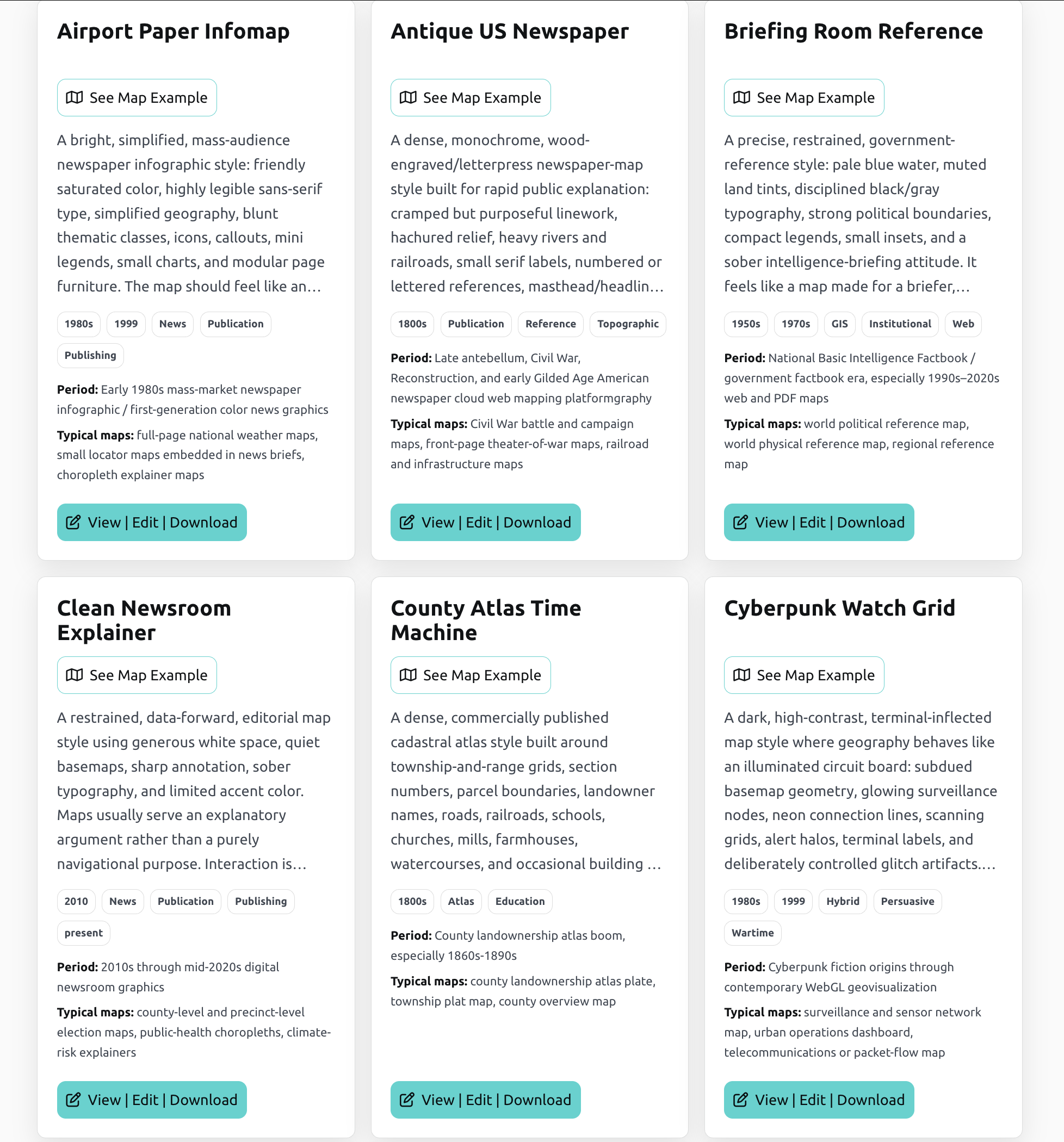
I will add the schema creator tool to the WebMapGPT agent repository soon so you, or your students, can build your own.
Importantly, each schema is an AI-assistant-ready style brief. It helps a prompt cartography agent or assistant understand not only what to draw, but how the map should behave visually: color logic, typography, label hierarchy, symbol behavior, layout, texture, context, and emotional posture.
In less fancy language: it gives the assistant something better than "blue choropleth, Arial labels, vibes uncertain."
Right now there are more than 30 schemas, with more planned: Swiss topo, National Park Service, spy-agency reference maps, cyberpunk dashboards, 1800s newspaper maps, periodical styles, propaganda map languages, ArcView-era GIS nostalgia, web cartography, visual journalism, and other cartographic oddities. I just created a Metro Map style one today that will go up shortly.
The point is not to copy one famous map. The point is to give your prompt workflow a design vocabulary.
You can open a schema, modify it, copy it, download it, and feed it into your own project or GPT workflow. A schema is not a sacred tablet hauled down from Mount Cartography. It is a starting condition. Just like detective shows don't all copy Law & Order, or Wallander, these map styles do not mimic any individual design. They mimic the trope. It's up to you to use your prompting to finesse the design to match the purpose and message of your maps.
So change the colors. Swap the typefaces. Tighten the hierarchy. Make the legend less polite – the best copy is confident copy they say.
Be Advised: These Schema Defaults Are Not the Destination
One thing I need to emphasize, particularly to students getting started in cartography: parroting great styles is a half-decent way to make a living. A lot of people have YouTube videos showing others how to create certain styles using different software packages, etc. And good designs normally translate over to other projects pretty well.
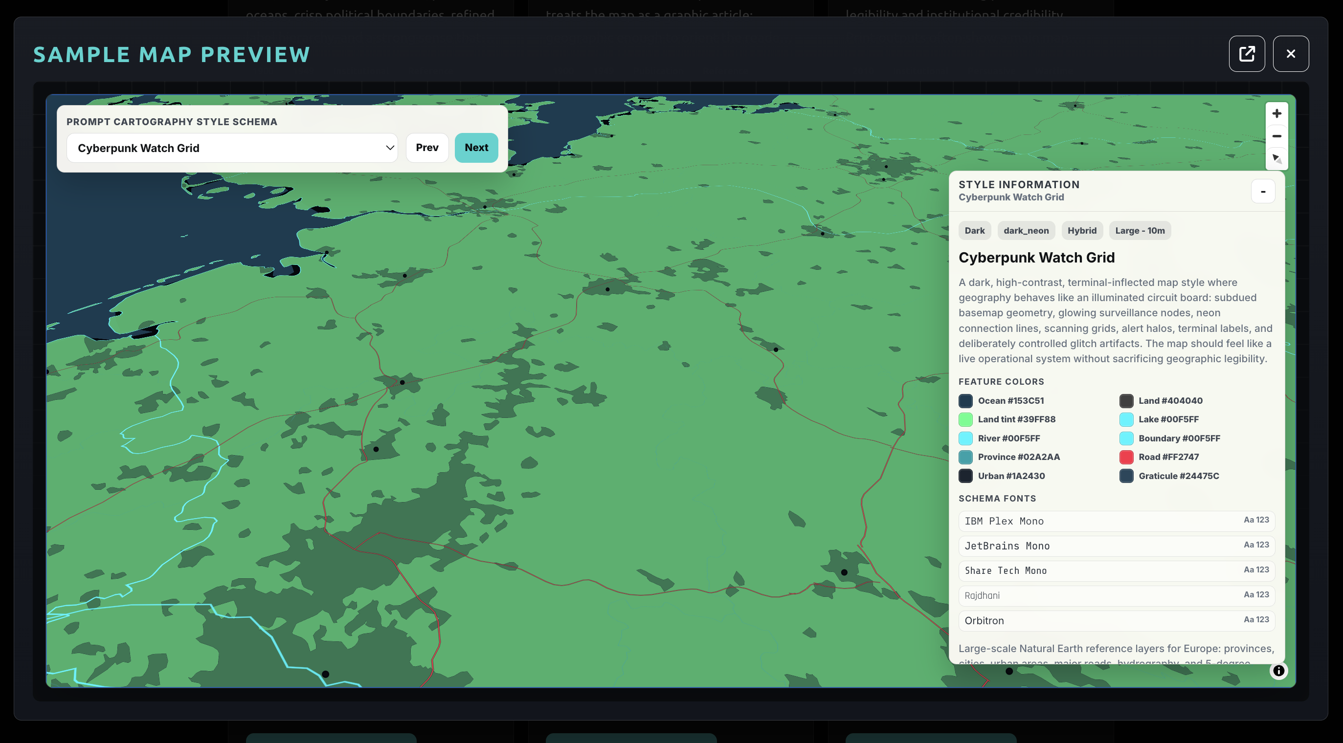
What you can't parrot, though, is originality. Consider all design schemas, no matter how great they may look to you, to be defaults. These design schemas are literally the default GIS map of yesterday. Better defaults to look at, in some cases, yes for sure, but still defaults.
The best maps don't use defaults. The bar has been raised in prompt cartography. You start with former creative greatness. It's up to you to adapt, iterate, and improve from there. That's the challenge – at least in my middle-aged dad mind. (My kids would probably disagree and tell me to jump in a lake. Fair enough.)
What I'm saying is...
In the past, copying one of these styles well took time (potentially years of research and style finessing).
Now the capture step is easier. In fact, it's done for you. That means the creative burden moves. The interesting work is deciding what to do with the captured style.
Use the schema, yes. But then push it. Adapt it. Hell, argue with it and swear at it. Make it stranger, clearer, quieter, louder, more disciplined, or go full nutso-butso (that is an official design term somewhere).
Evolve map design, damnit! That's why we're here. That's how we human cartographers stay relevant. Not by doing the same things over and over.
I do believe that joy in life is found in the pursuit, not the capture. Cliche, right? Yup. And true. (One doesn't necessarily negate the other. Logical fallacy.)
Prompt cartography means you no longer have to spend all your energy capturing these styles from scratch. Start from the point of capture and pursue new ones.
Find the growing design schema library here and view simple color/font previews of each:
https://www.promptcartography.com/design-schemas
Edit a schema you like in the browser, markdown or json. Copy or download your edited version. Feed it into WebMapGPT or your own prompt mapping workflow tools.
Please share with me anything you create that you're proud of. Prompt cartography has social media feeds on the bottom. You can find me there.
From the WebMapGPT garage in flyover country USA...
Happy prompting, mapmaking friends!
Ian
A Note on the Prompt Cartography and WebMapGPT Website Differences
Why am I hosting these on Prompt Cartography and not WebMapGPT you might ask? Is this a ruse to sell more books? (According to The Atlantic, no one is going to read anymore, so the answer is an unequivocal no.)
However, Prompt Cartography is my textbook and educational outreach site. It's where I will start posting tools for prompt cartographers to use in their workflows – which is a big topic in my book, so it makes sense there.
WebMapGPT, on the other hand, is my skunkworks lab. It's the garage (literally) where I sit creating: rants, experiments, #365DaysOfMaps output, tools, prototypes, and the occasional argument about why parts of the creative class are wrong about LLMs. With the huge caveat that I, too, may be wrong. Alas... science. No certainty whatsoever.
It is also where I eventually want to publish more prompt cartography workflow maps that I have spent slightly more than 30 minutes building. It is the experimentation and output space.